Spacer
Denver Zoo Website Redesign

Project introduction
Summary:
For this project, I evaluated current issues with the Denver Zoo’s website and created a redesign for improved clarity and usability. With the Denver Zoo receiving over 1.8 million visitors per year, this project would greatly improve the user experience of the zoo's patrons if it were to be implemented.
My role:
I was the sole designer and researcher for this project.
Challenge:
The Denver Zoo faces several challenges that I aimed to tackle in this project. The current process for buying tickets on the Denver Zoo's website is inefficient and confusing, leading to overall customer dissatisfaction. Additionally, the site lacks technical reliability and requires the user to go through too many pages before they can input their payment information and purchase tickets.

placeholder
Research
Usability testing of current experience:
To better understand the pain points in the Denver Zoo's current experience, I conducted four interviews. For each interview, I had the participant walk through the process of purchasing tickets, asking questions such as “What information, if any, is missing from this page?” and “What if anything is unclear or confusing?” Through this testing, I identified opportunities for improvement, mainly in reducing the cluttered feeling of the pages and streamlining the process overall.
Competitive analysis:

placeholder
To gain a better understanding of how the digital experience at other zoos stacked up to the Denver Zoo I conducted a competitive analysis. This information allowed me to formulate the following how might we statements:
How might we make the user flow to purchase a ticket on the Denver Zoos website easier and more intuitive?
How might we offer more payment options besides a credit/ debit card?
How might we improve add-on pop-up screens to be more clear and less distracting?
Design
Problem statement:
Customers need an easier way to purchase tickets to visit the Denver Zoo because the current system is complicated and difficult.
User flow:
I created this user flow diagram to map out the ideal process that a customer would go through to purchase tickets to visit the Denver Zoo. Pages are represented by squares and decisions are represented by diamonds.

placeholder
Low fidelity wireframes:
Starting the prototyping process, I created hand-drawn, low-fidelity wireframes to lay out the digital experience and demonstrate what interface elements would exist on the pages of the site. Drawing these out was a critical start to the design process since it allowed me to define and plan important elements. Creating a more straightforward design for the date, time, and ticket inputs was one of my top priorities as this was one of the most confusing aspects of the current website.

Placeholder
Mid fidelity wireframes:
As I started developing my mid-fidelity wireframes, I focused on taking customer feedback into account. I wanted to address the pitfalls of the current site to create a better experience for the Denver Zoo's customers. Through feedback from my original interviews and my professor, I was able to eliminate unnecessary elements in the mid-fidelity wireframes such as boxes around sections of the site and slightly confusing input fields.
Placeholder
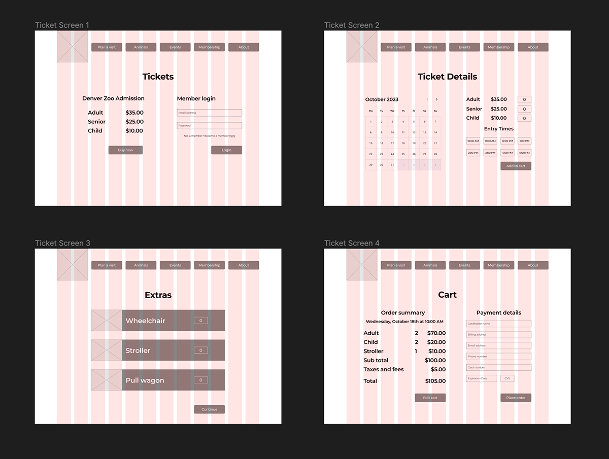
High fidelity interactive prototype:
Transitioning into my high-fidelity prototype, I began designing the desired features while improving upon more detailed design feedback. The implemented layout allows the user to go through the ticket purchase process with minimal effort and time. The following prototype shows how a family (2 adults, 2 children) would purchase 4 General Admission tickets to the Denver Zoo and a wagon rental as guests (non-members). Please click here to interact with the prototype.

Instructor feedback:
Throughout this process, I gained lots of helpful feedback from my instructor. Receiving comments on my wireframes and Figma files throughout this project allowed me to make the necessary adjustments and changes to create a clean design. Most of the feedback throughout this project was small design changes, such as grid spacing and alignment issues.
Evaluation and results
User testing process and pain points:
During the user testing of my interactive prototype, I received very insightful feedback that allowed me to improve my design. My testing process consisted of conducting two interviews with separate people from my original testing group. I conducted these interviews in person and led them through the user flow using the discussion guide pictured below. The main pain point I received feedback on during my interviews was the lack of information on how long the zoo ticket lasts. My interviewee wanted more information about whether or not it is a day pass and how the tickets are delivered (digital or printed). To fix this, I added clarifying text that lets the customer know the ticket is good for the whole day. Additionally, making it clear that the rental choices are optional was a key piece of feedback I got from both of my interviewees.

Updates:
To fix the lack of information on how good the zoo ticket is good for, I added clarifying text that lets the customer know the ticket is good for the whole day as well as the delivery method. To address the issue of the rentals not clearly being optional I added a skip button and some clarifying text.
Reflection
Future plans:
Moving forward, I plan to clean up this case study as I build my new portfolio website. If I had more time to work on the project itself I would like to redesign some of the other pages on the Denver Zoo’s website and create a more fleshed-out prototype of the whole site. Additionally, it would be nice to get feedback from someone at the Denver Zoo on how the improvements could work into their business.
Conclusion:
This project was a great opportunity to improve upon my UX design skills and gain experience redesigning an existing website. I enjoyed learning about the importance of designing systems, conducting research, and iteration. Walking through the UX process from start to finish was another aspect of this project that I found valuable. Since I hadn’t worked with an existing design system this was a new challenge that allowed me to expand my knowledge and skills. Overall this project taught me a lot and I hope to transition that knowledge into my future career.

